Brand • E- Commerce • AR Case Study
Project Overview
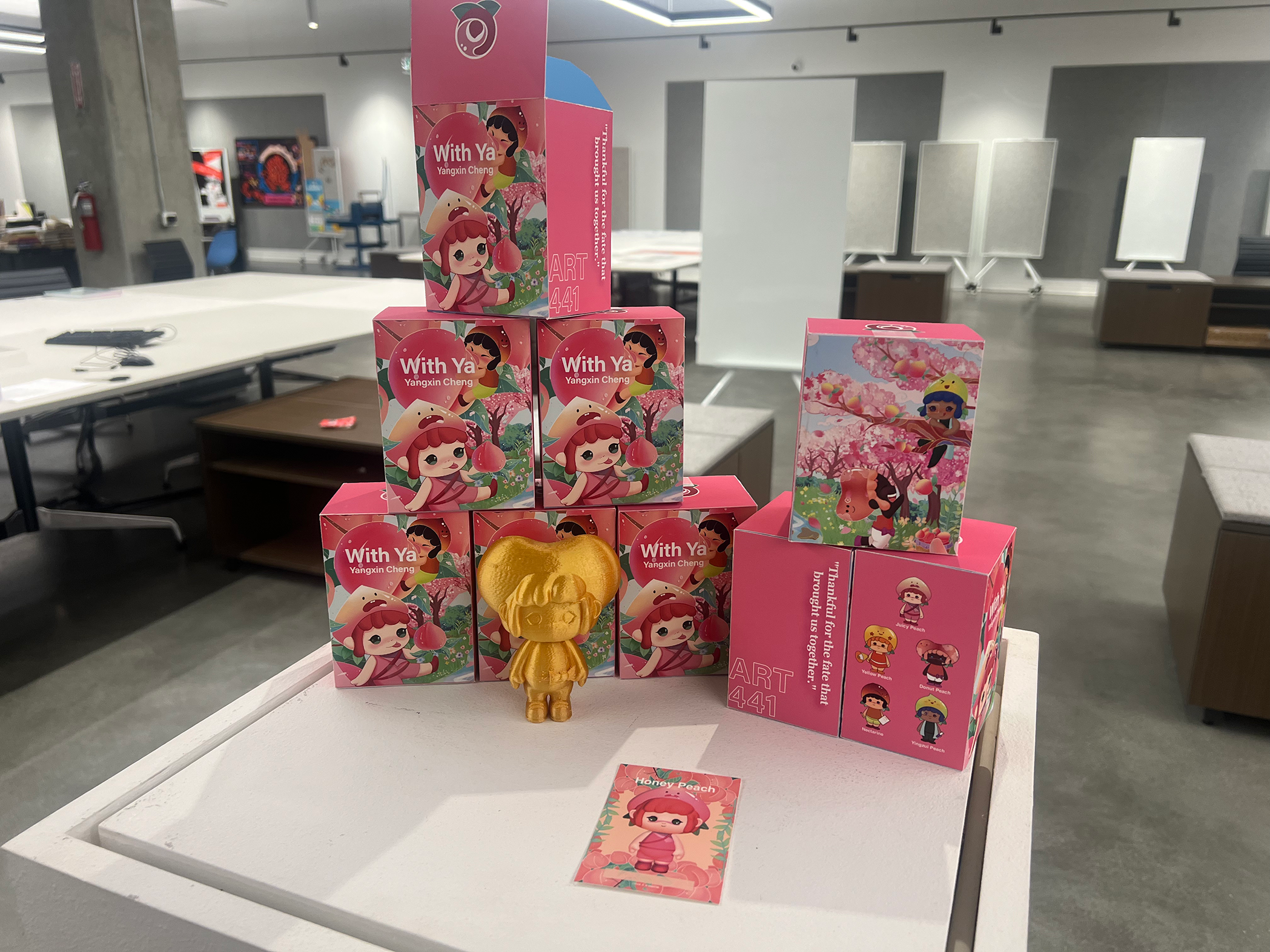
Fruit Talk is a farmer-support brand that combines peaches with blind box culture to bring fresh energy to agricultural sales. The project builds a playful, modern visual system to attract young consumers and help farmers transition into the digital era.
Year
2022 - 2024
My Role
Researcher, Designer, Producer
Related Field
Branding; Mascot Design; Product design; Package design; UIUX; Illustration
The story began from .....
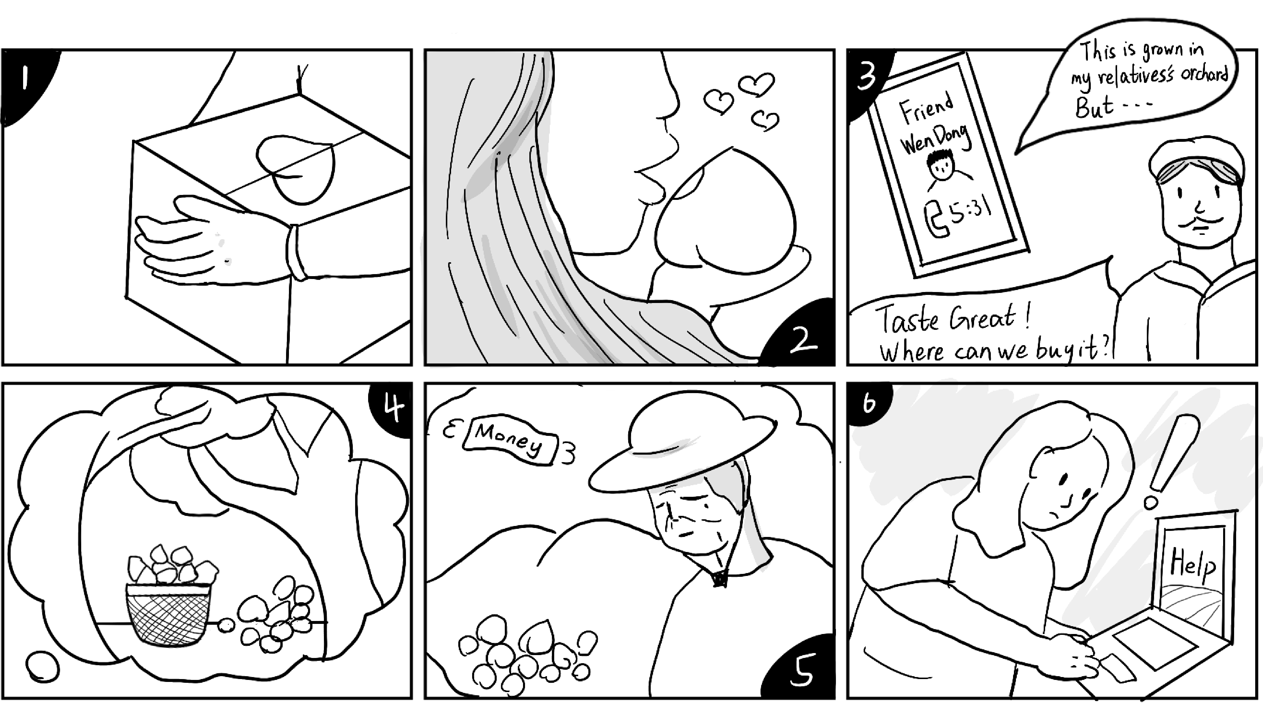
I started my research from Yimeng Mountain, China’s peach town:
180,000 kg of peaches go unsold each year.
85% price gap between farmers and distributors.
Only 10% of value stays in the local industry.
So, we decide to do something for them .....
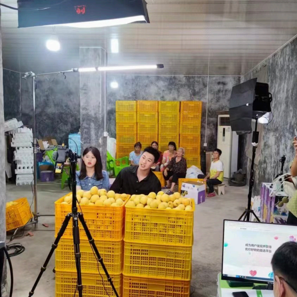
E-Commerce livestreams
for rural support
Live time : 29th July 2022, 18:30 - 20:30
Duration : 2 hours
Number of viewers: 2130 total, 678 average
Live streaming revenue: RMB 6,824
Number of orders placed: 124
We bring
A 13.8% increase in online sales;
Increasing user engagement by 32.4%
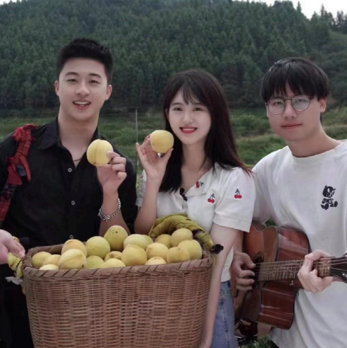
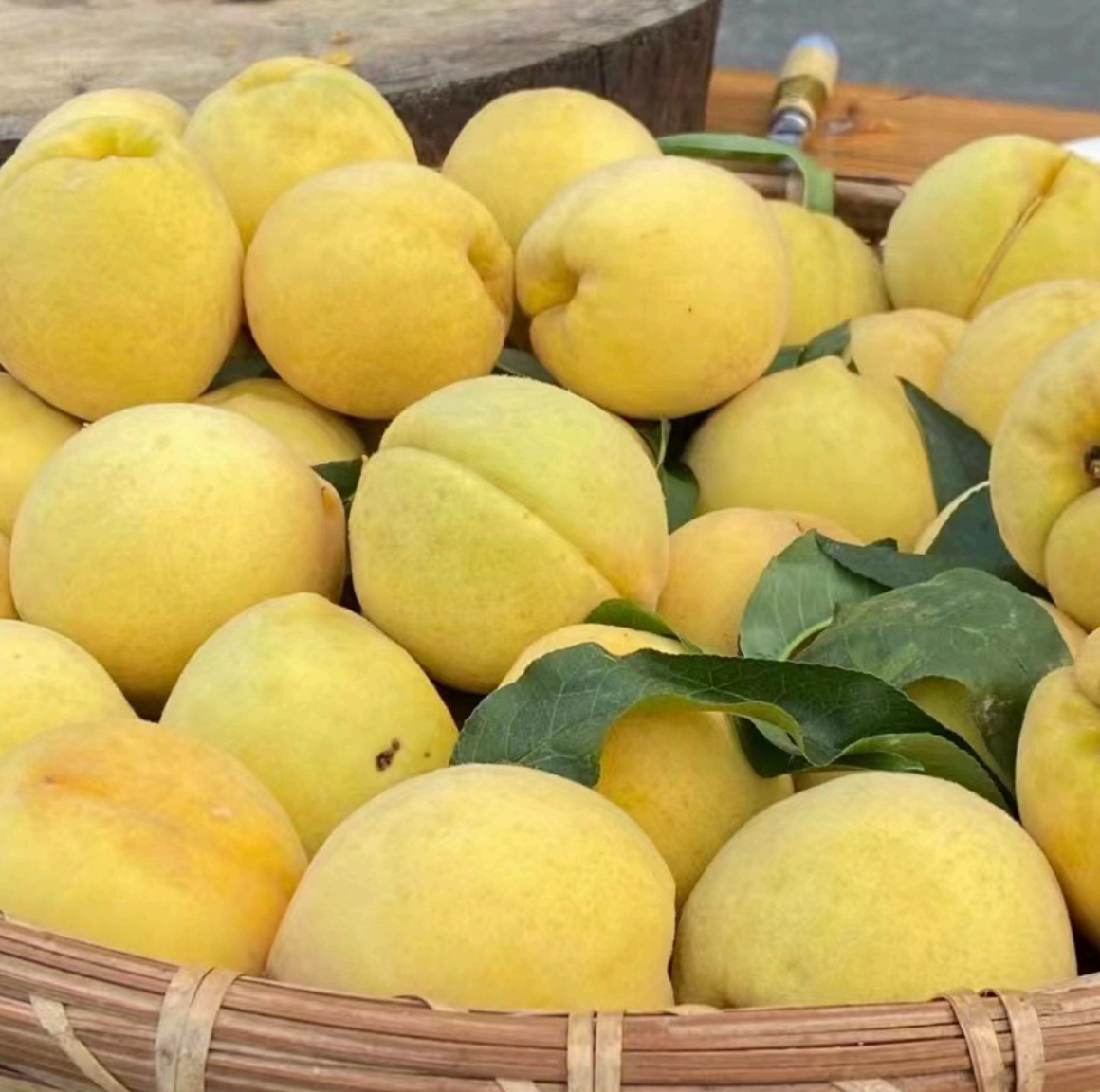
But it's only temporary and not permanent.
What can I do as a designer?
Fruit Talk is a youth-driven agricultural brand that blends local peach farming with pop culture. It breaks away from outdated, low-value perceptions of rural goods through bold visuals, playful packaging, and digital engagement.
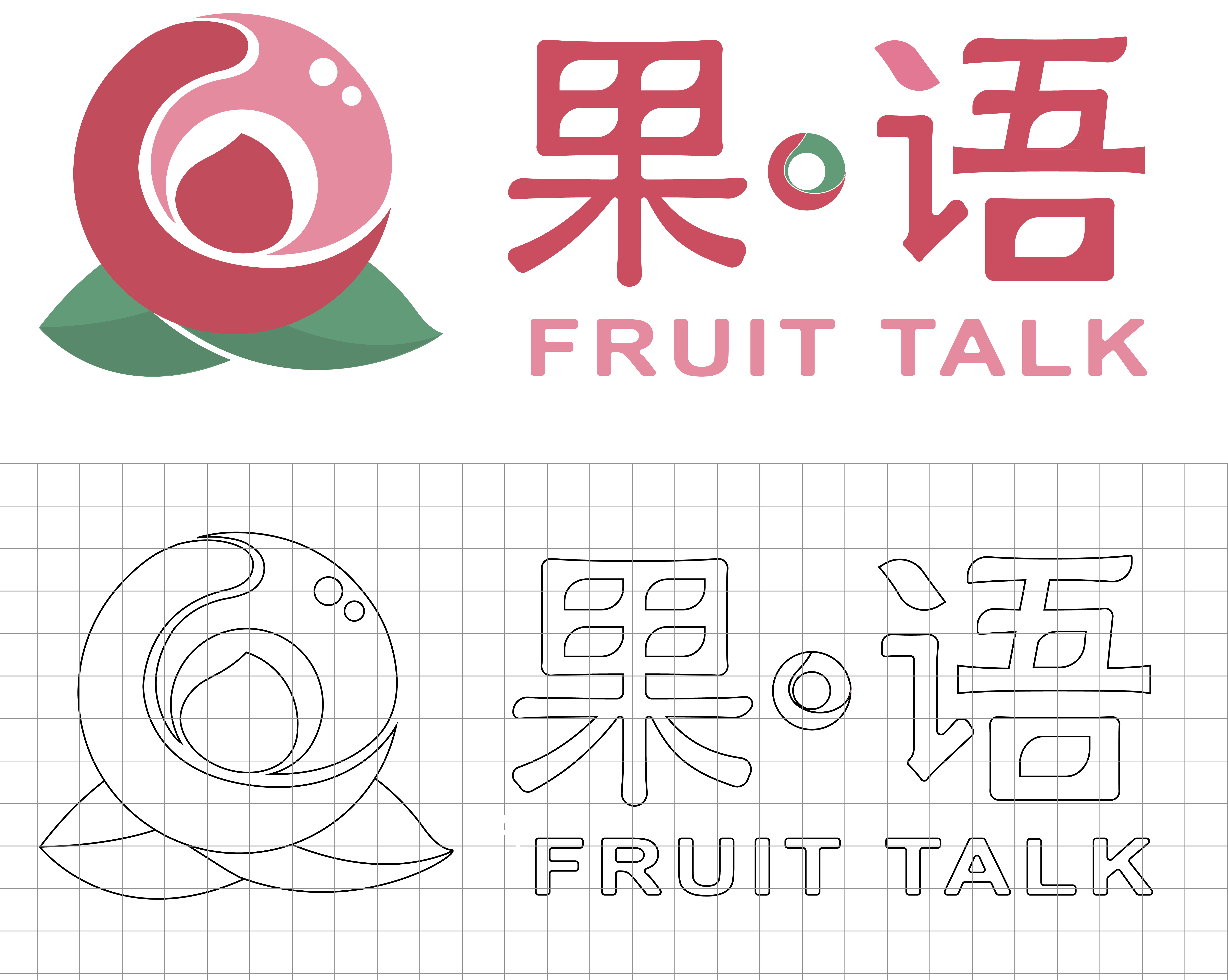
Logo Design
Mascot Design - Tao Tao Tribe
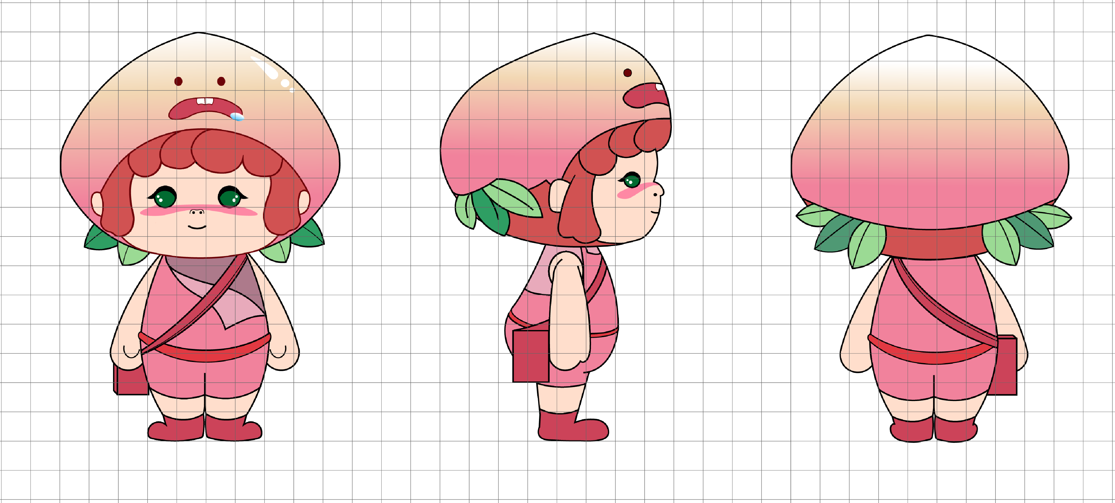
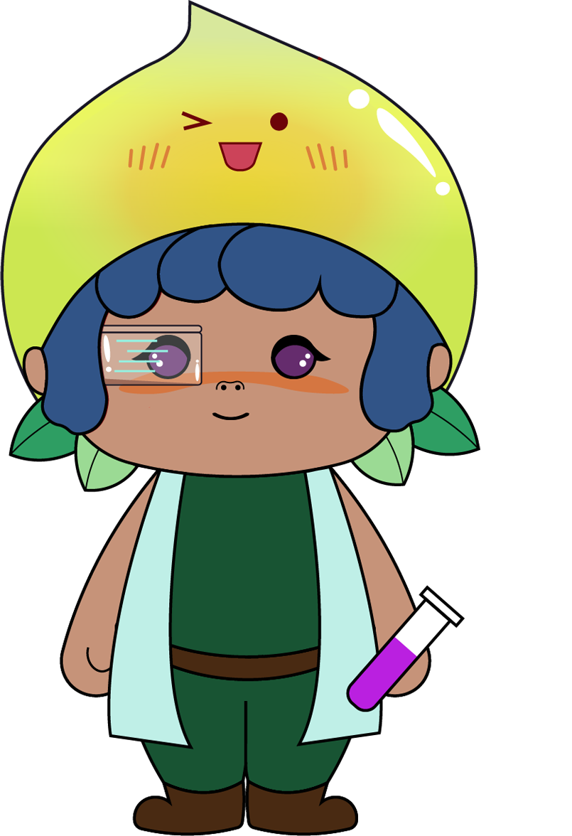
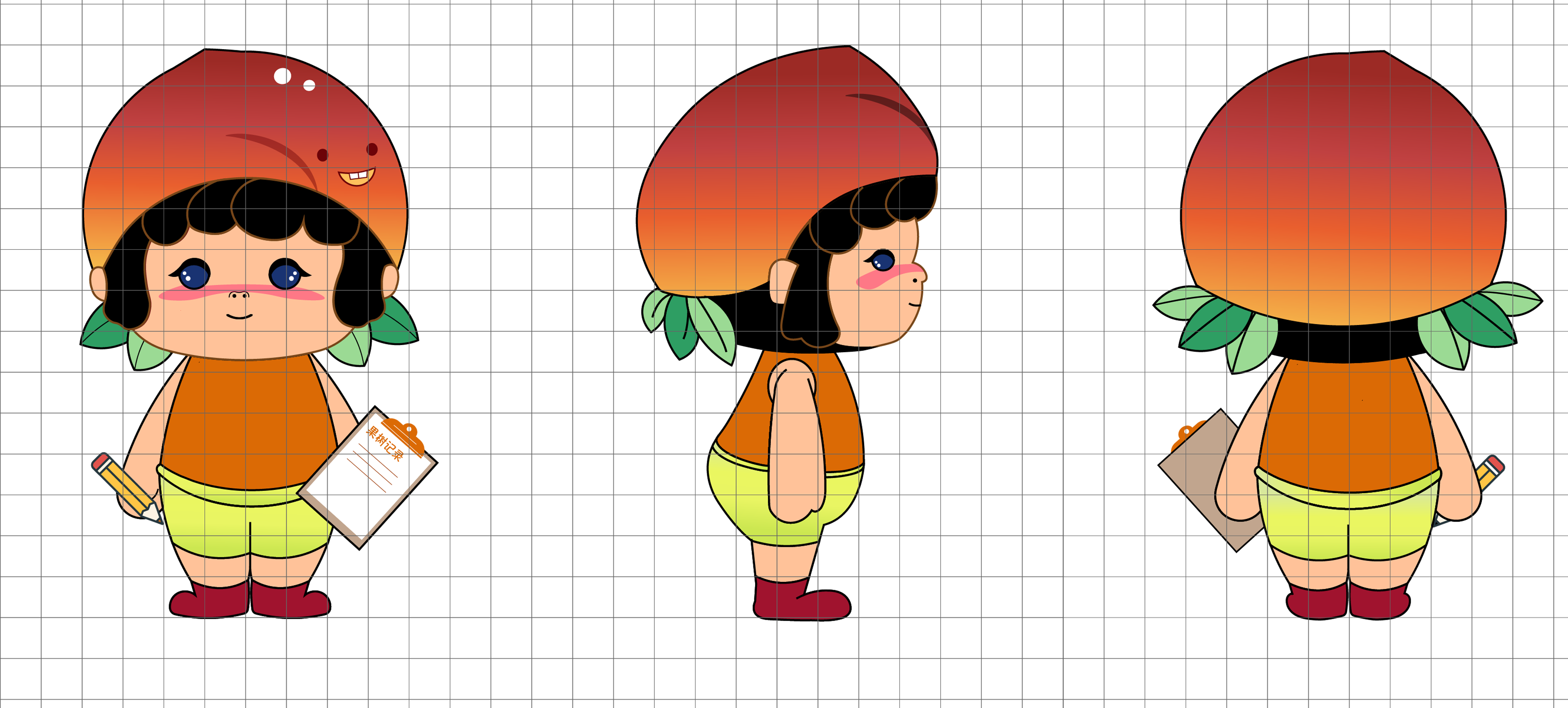
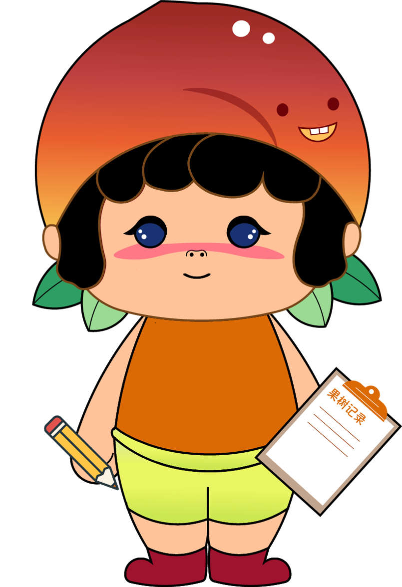
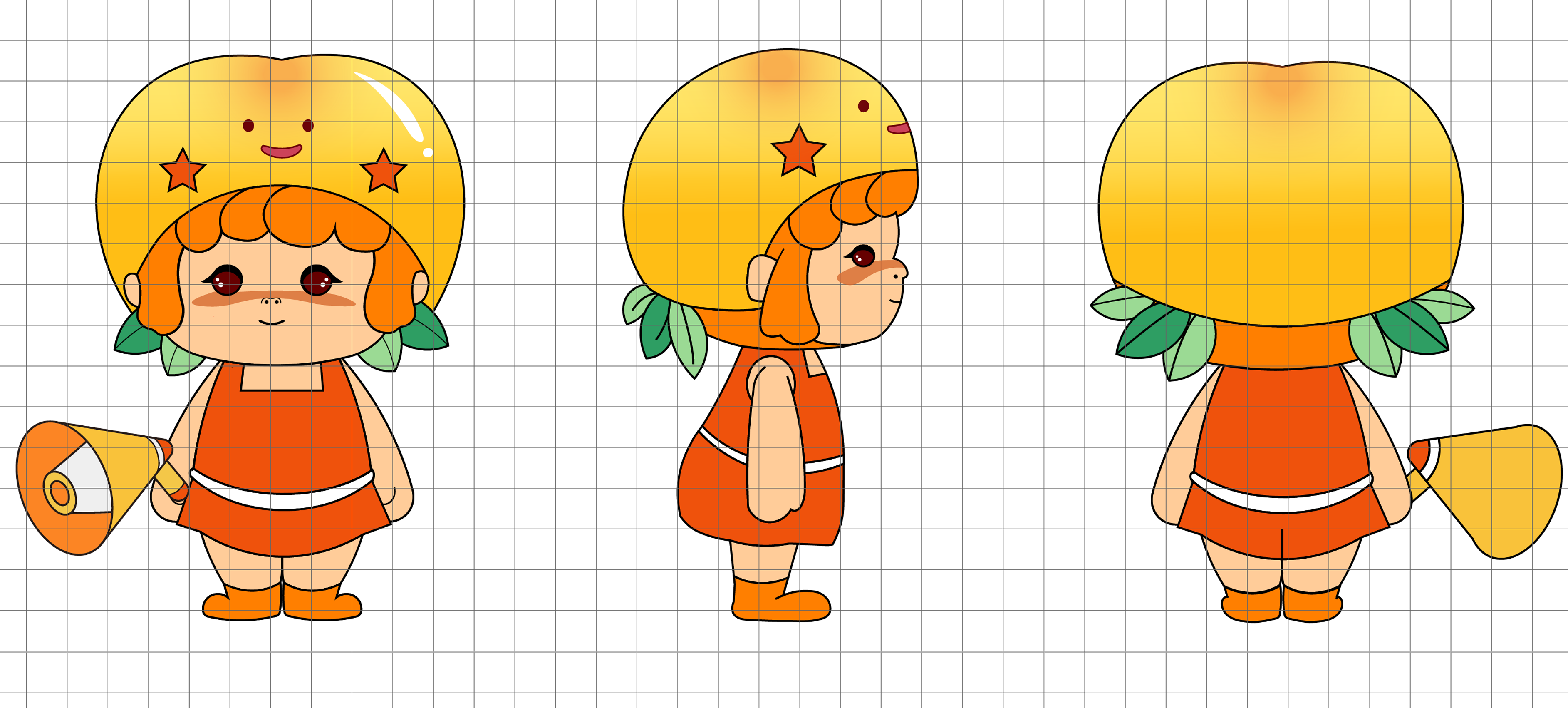
The family mascot as a visual identity for the brand is derived from the five types of peaches around which the brand is based: the honey peach, the hawksbill peach, the yellow peach, the peach, and the nectarine. And each mascot has its own occupation,
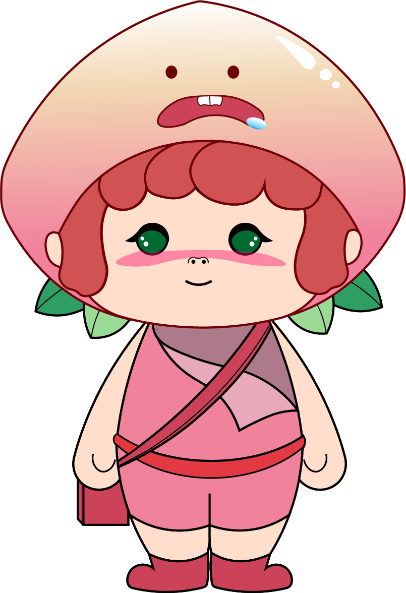
Role: Orchard Peach Transporter
Mission: Making sure every peach gets home fresh and happy
Personality: Gentle · Attentive · Always smells like summer
Role: Customer Happiness Hero
Mission: Resolve every issue with sweetness.
Personality: Soft-spoken, sweet, always ready to listen.
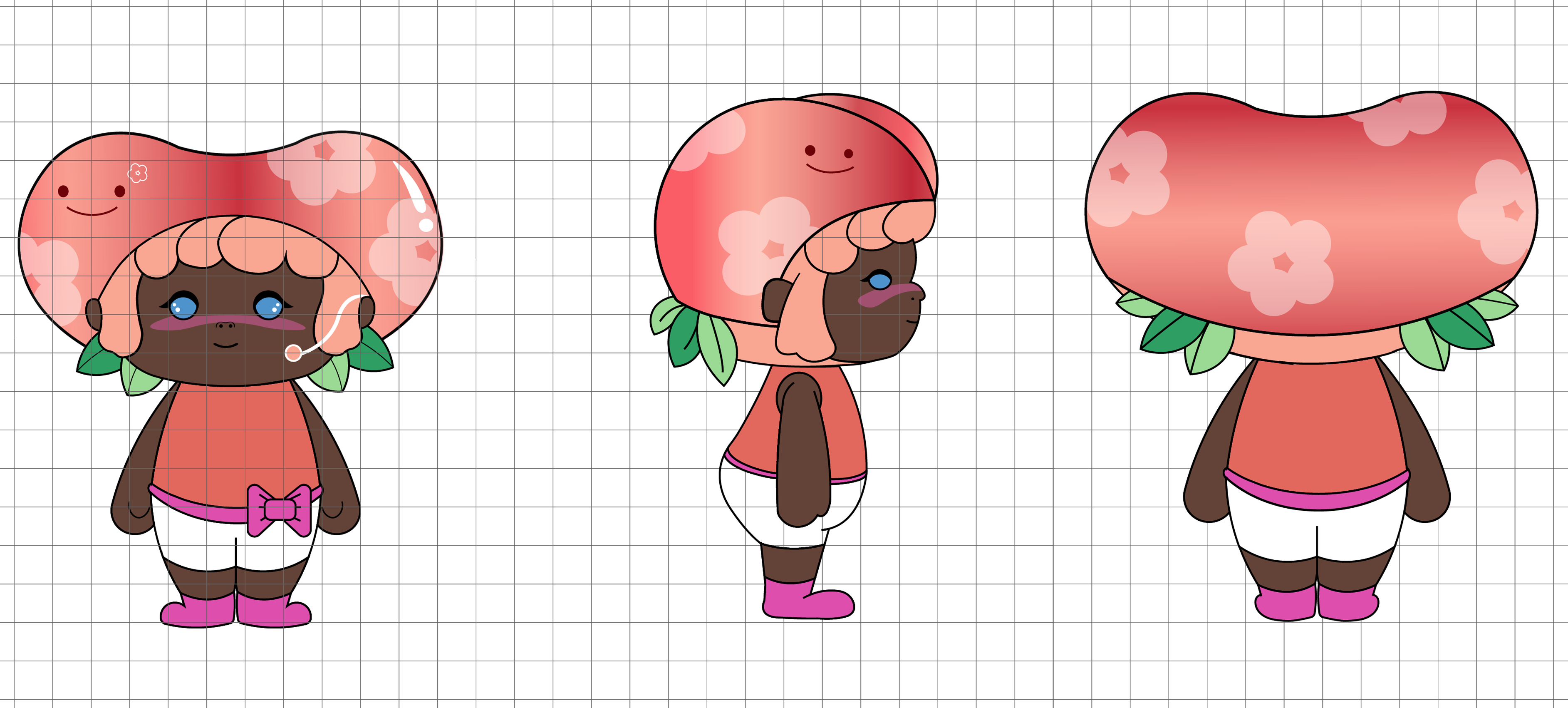
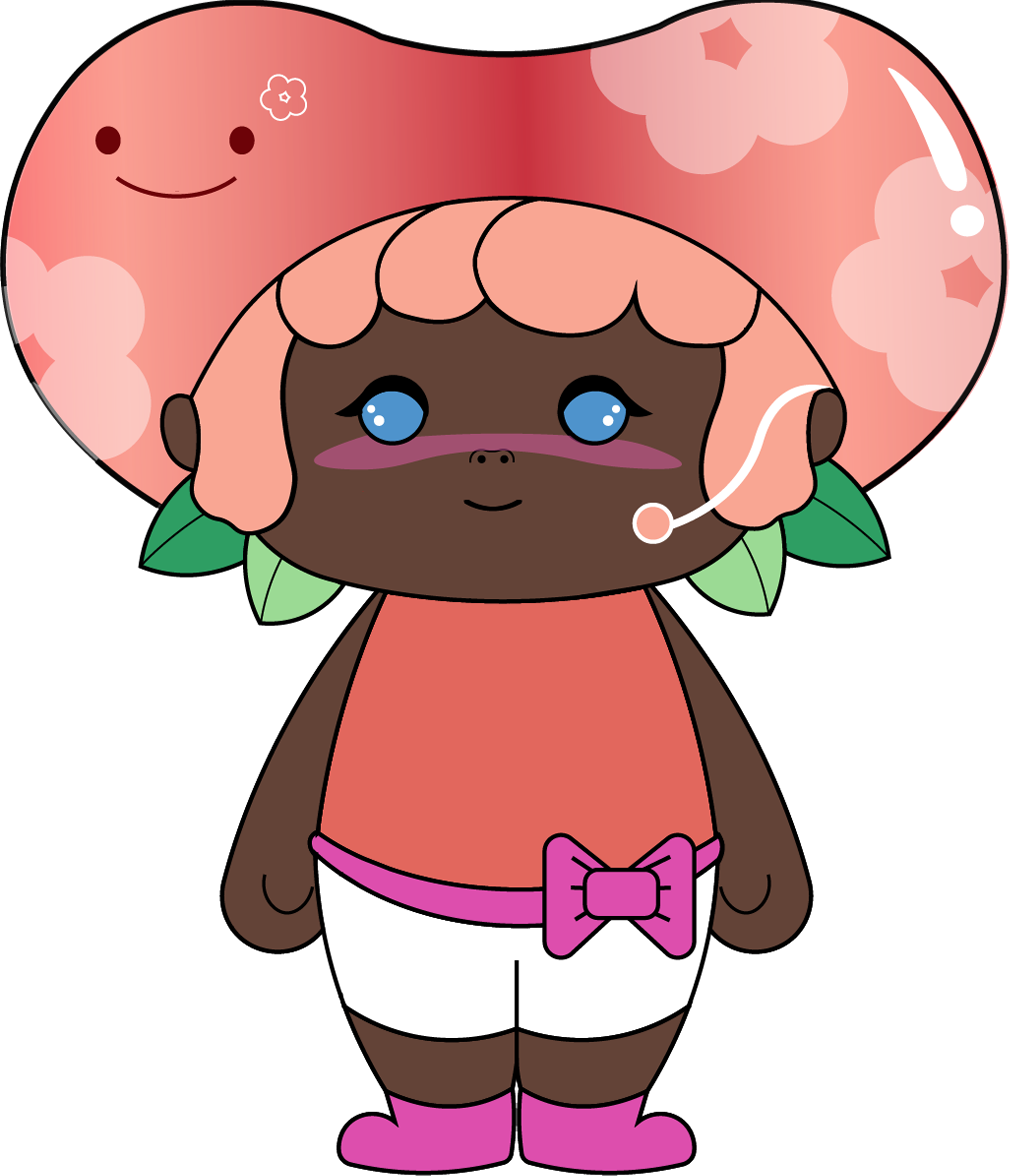
Role: Quality Inspector
Mission: Taste, touch, test~ Spot the best, discard the rest.
Personality: Shy but sharp, takes her job seriously.
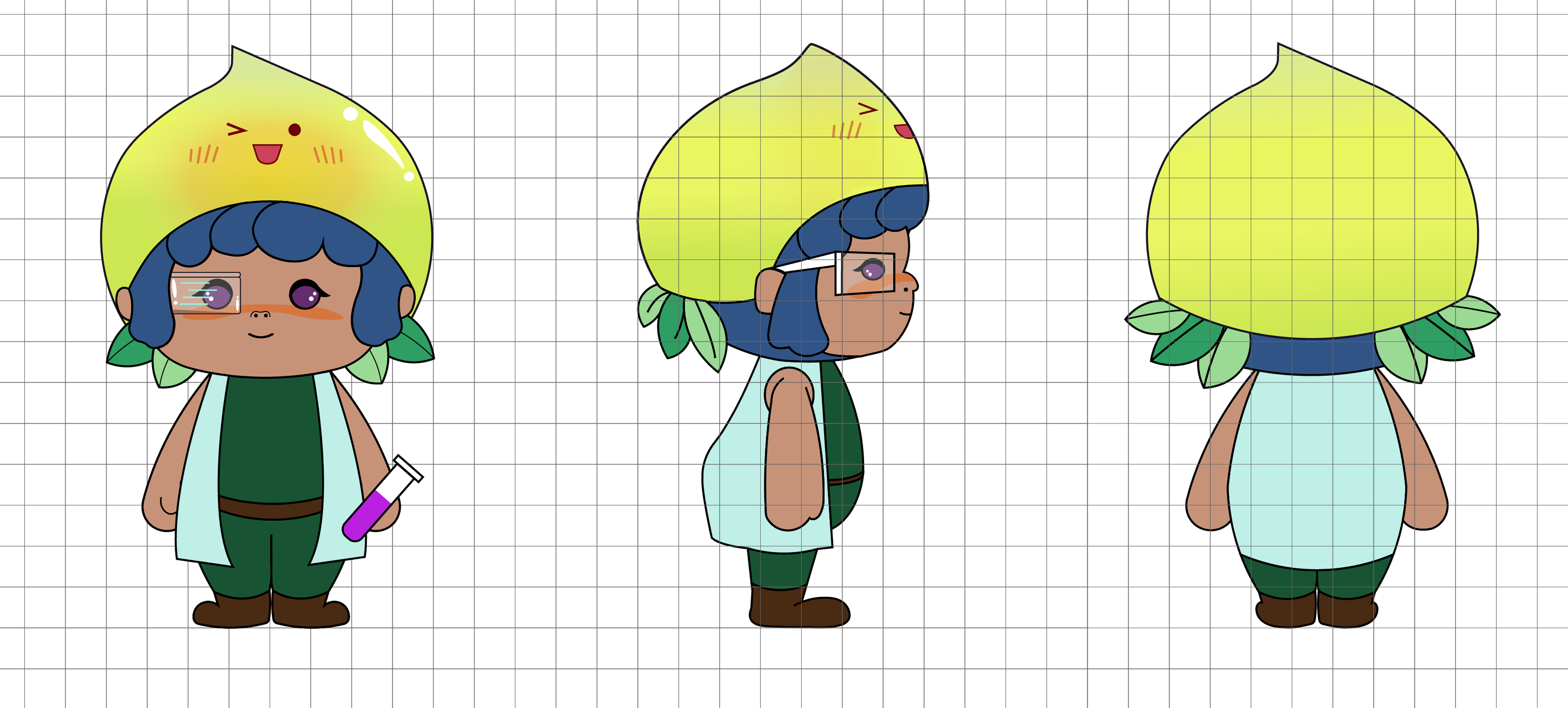
Role: Freshness Record Keeper
Mission: Track every growth moment for total transparency.
Personality: Strict but reliable, notebook always in hand.
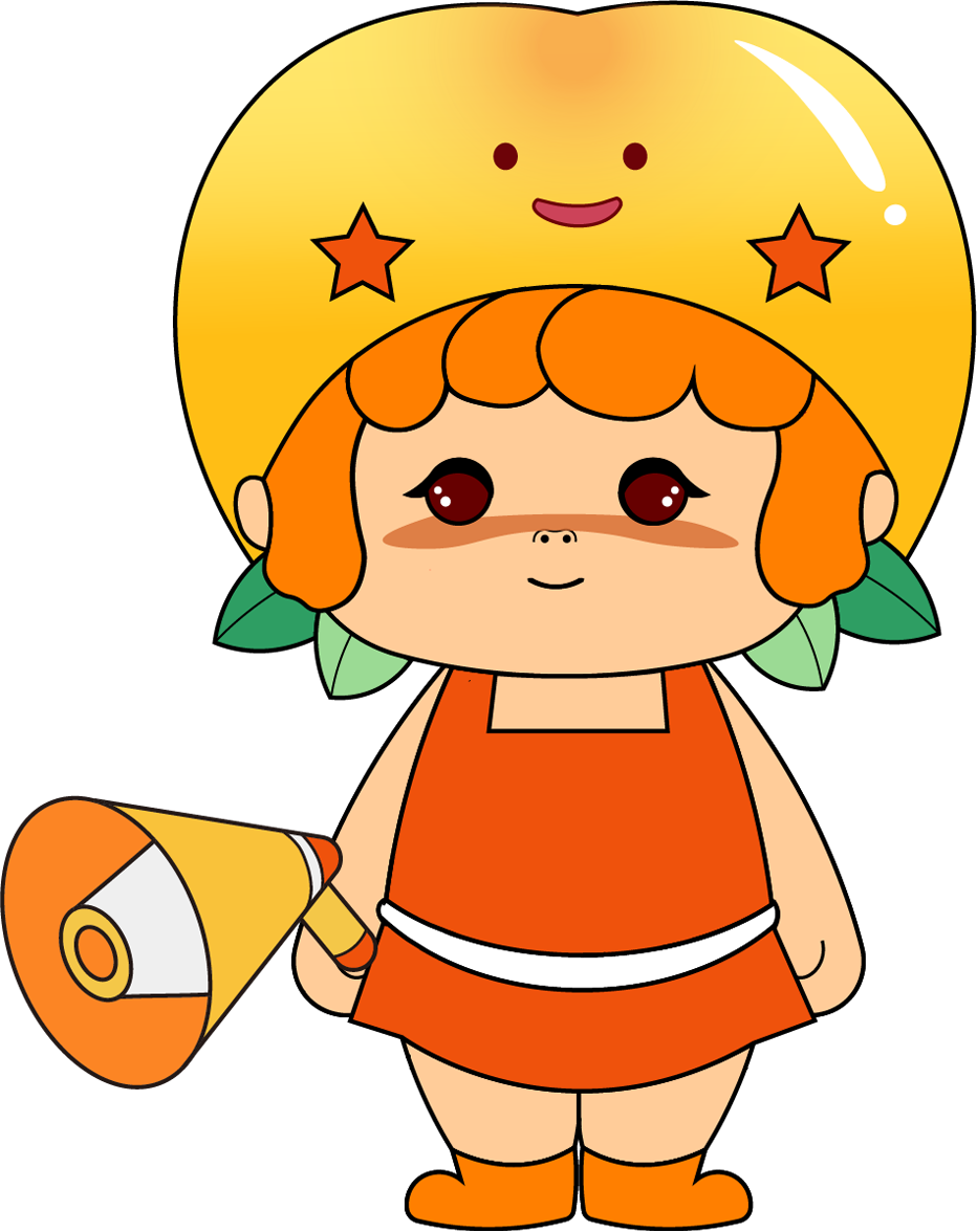
Role: Brand Cheerleader
Mission: Shout out to the world how amazing our peaches are!
Personality: Loud, sunny, full of heart.
Mascot Expressions
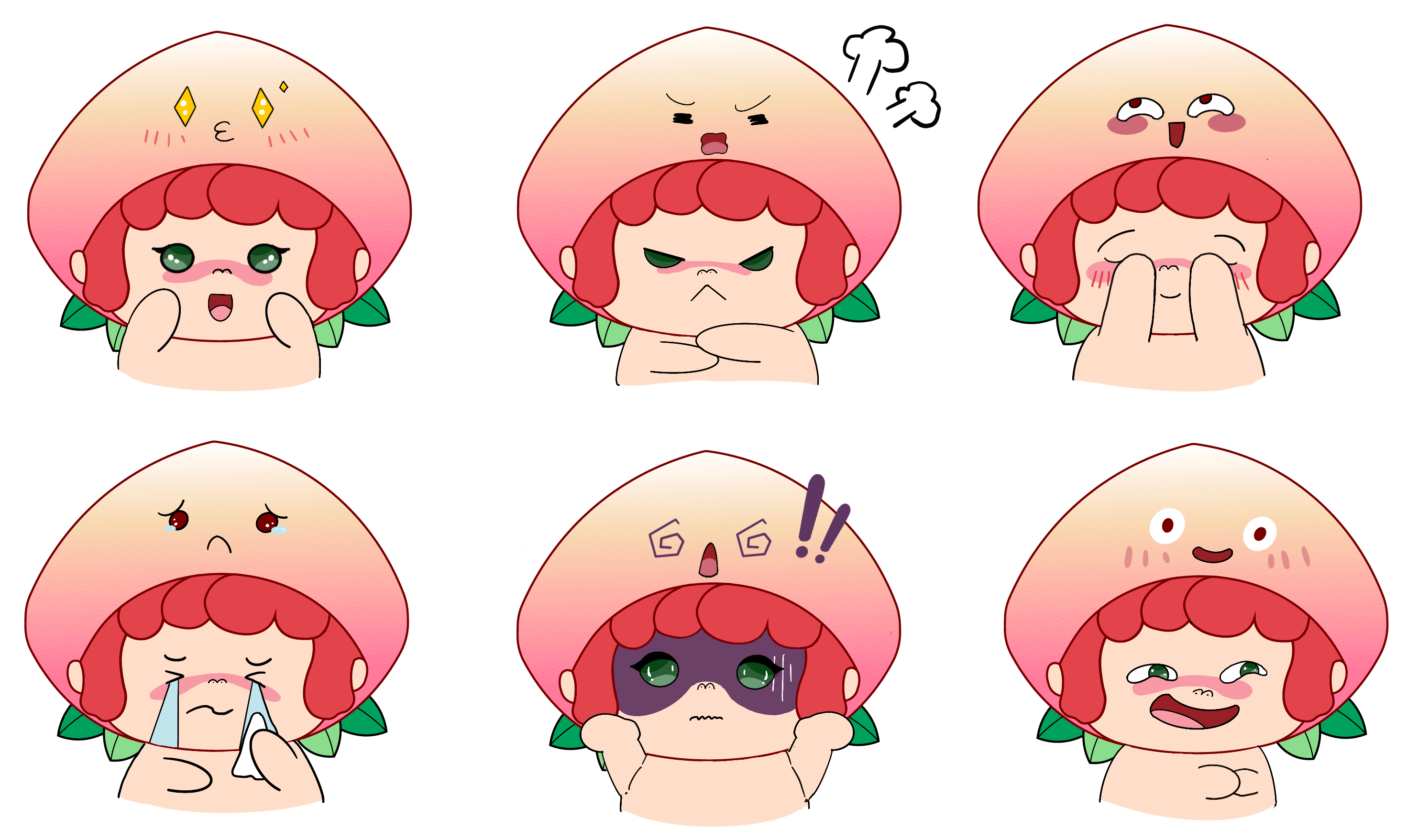
Express yourself with our playful peach emoji! Mascot’s expressions are more than cute—they’re a whole mood. Whether it’s a wink, a pout, or pure joy, each sticker helps build a deeper, more personal connection between our brand and a new generation.
Peachverse Adventures
Product
- SIZE: 11*8*22cm/4.3*3.1*8.7inches
- MATERIAL: Polyester, PVC
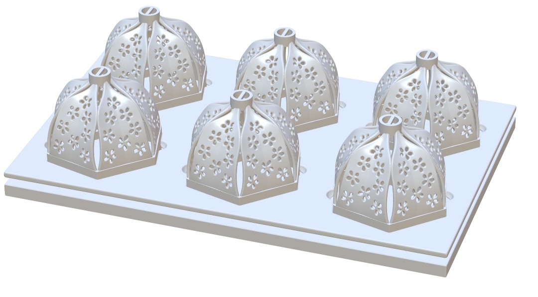
- PRODUCTION METHODS: 3D Printing
Identity Card
Not suitable for persons under 15.
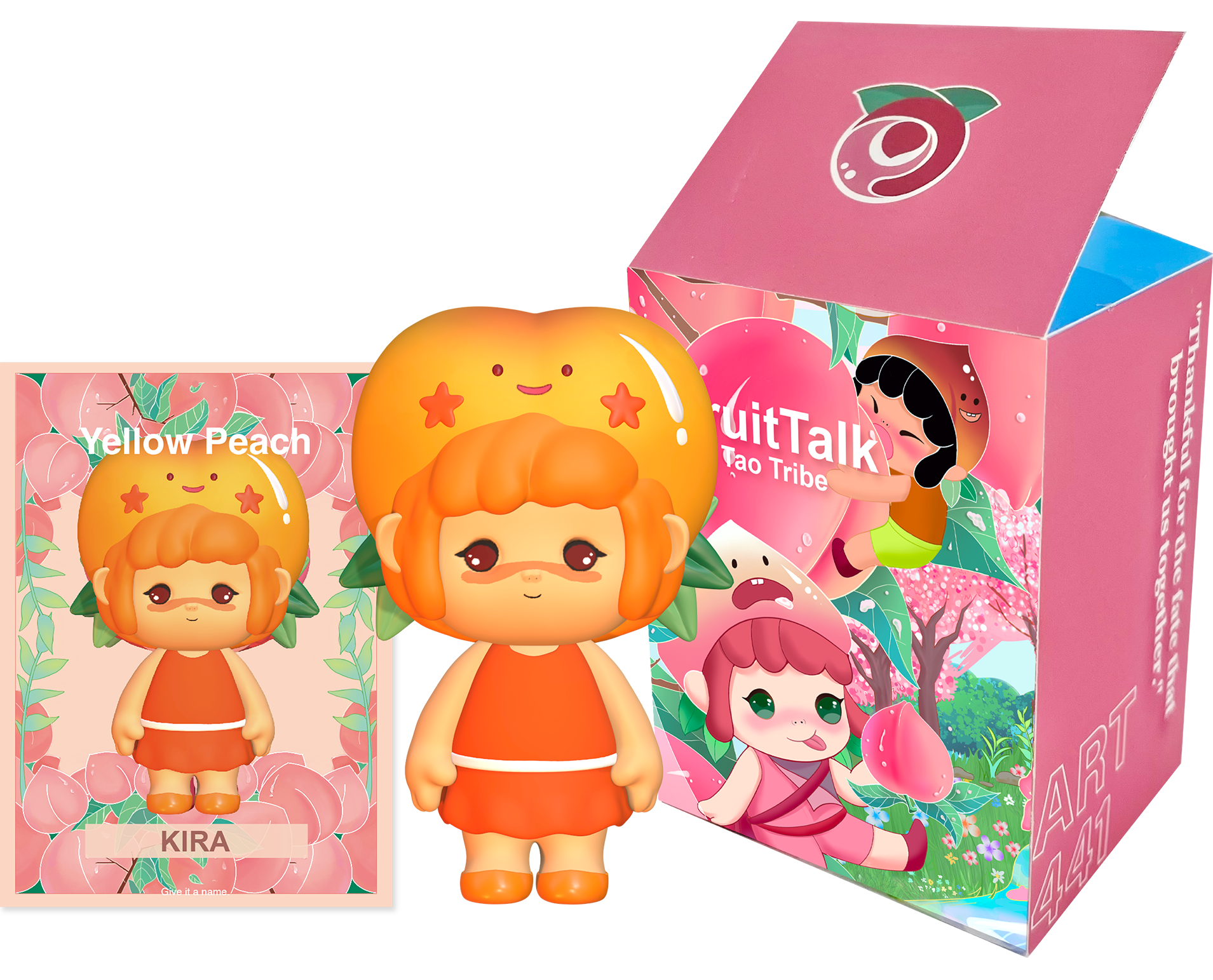
Package Design
The family mascot as a visual identity for the brand is derived from the five types of peaches around which the brand is based: the honey peach, the hawksbill peach, the yellow peach, the peach, and the nectarine. And each mascot has its own occupation,
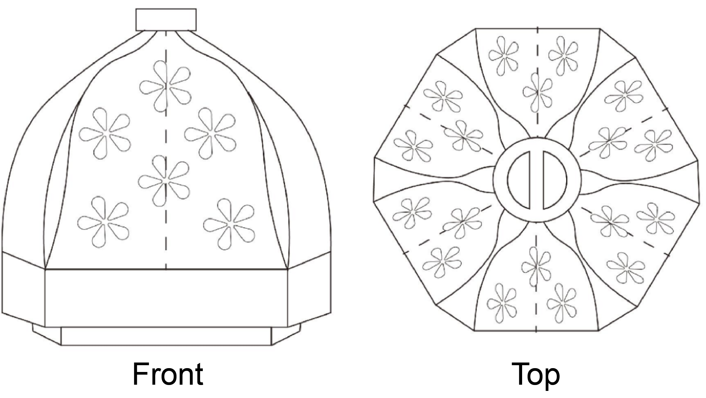
Each peach is gently protected in its own paper wrap — preventing damage, keeping freshness longer, and offering a soft, fuzz-free experience. The eco-friendly design also invites creative reuse

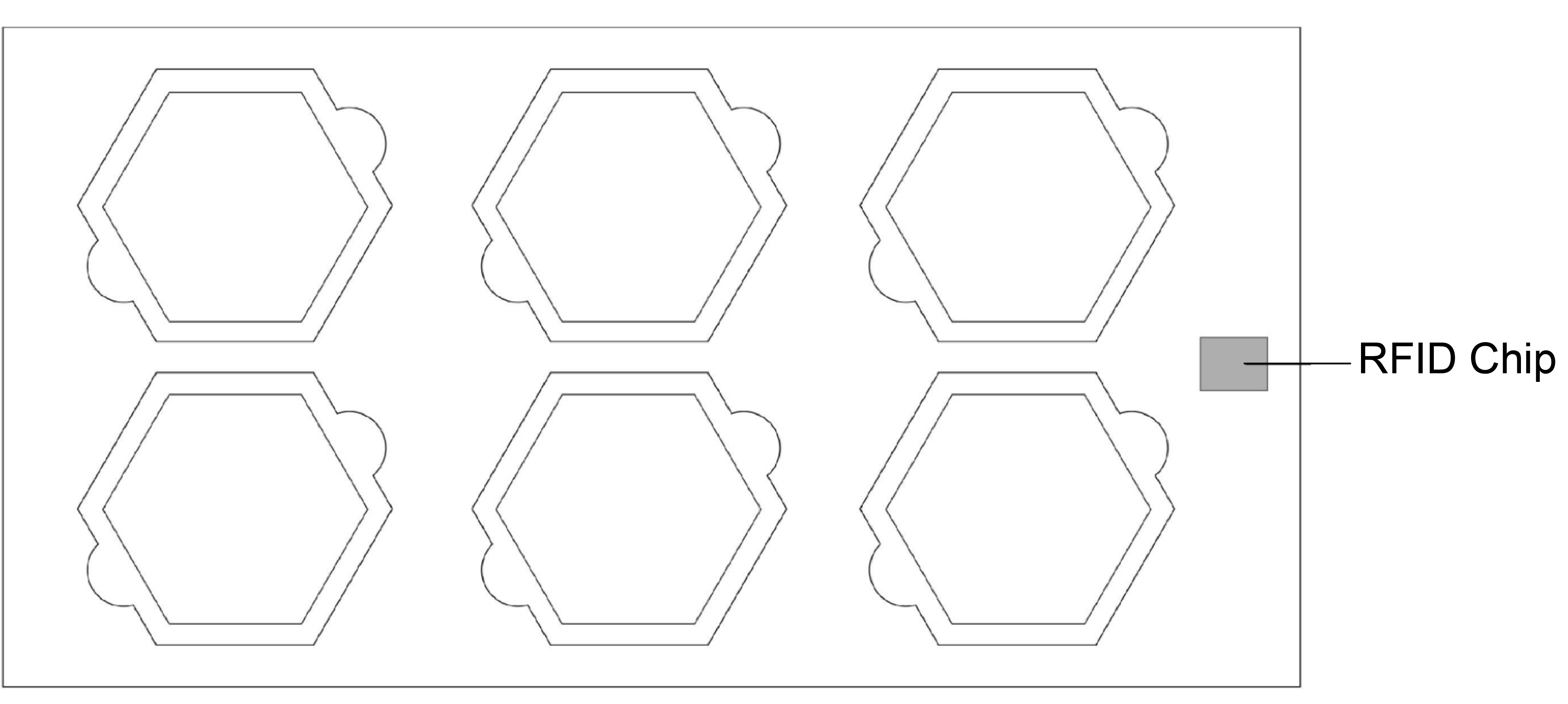
Track every step — from tree to table
RFID-Embedded Fruit Tray
Follow the journey:
→ Harvesting
→ Packaging
→ Logistics
→ Delivery
Web Design - UIUX
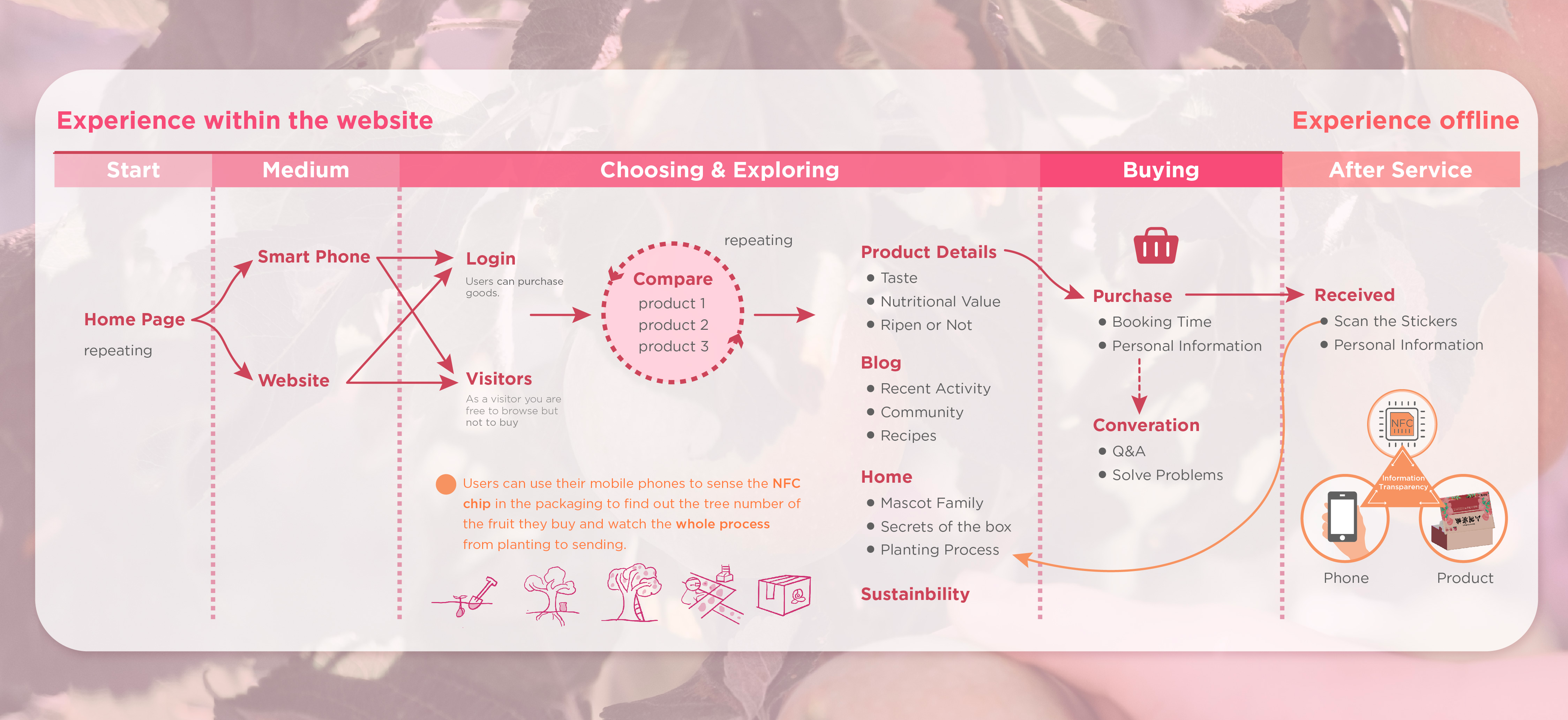
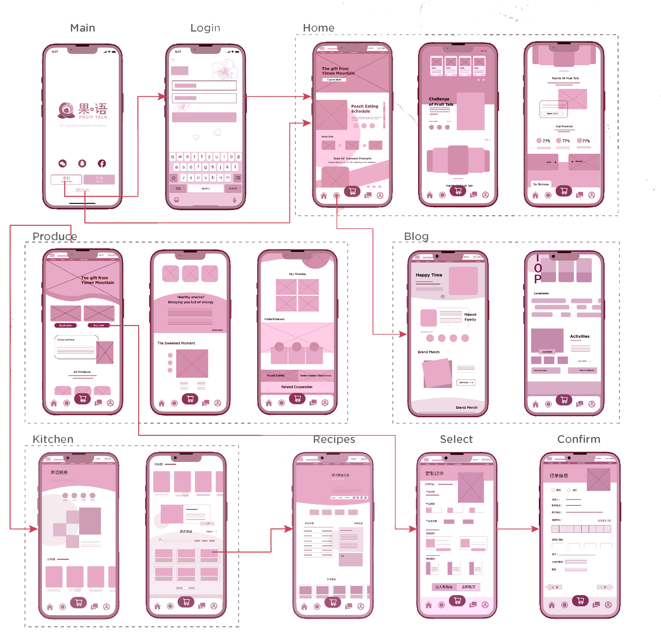
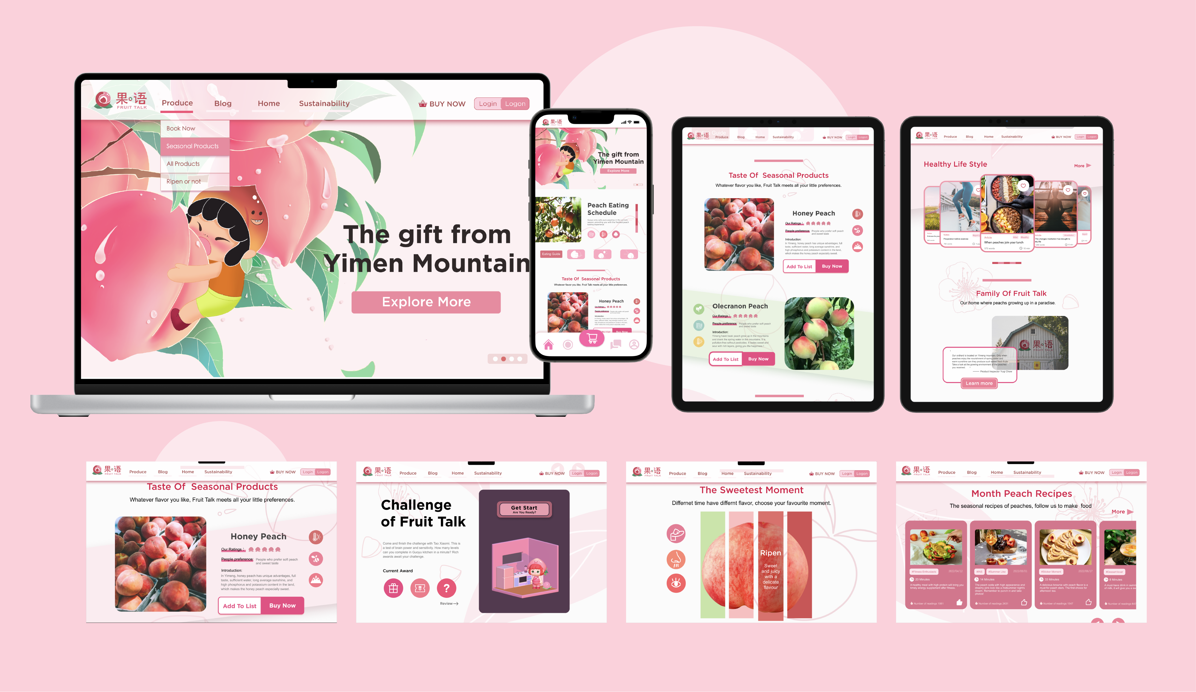
I designed the UI/UX flow for the orchard brand’s website and mobile app, guiding users from ordering to peach tracking and ripeness education. The mobile app supports chip scanning for farmer-product-consumer interaction, with blog content enhancing emotional connection and brand loyalty.

Our main color, peach pink, reflects our product and warmth. The secondary orange adds energy and sunshine, capturing the orchard’s lively spirit. Together, they create a unified, warm, and vibrant brand identity.
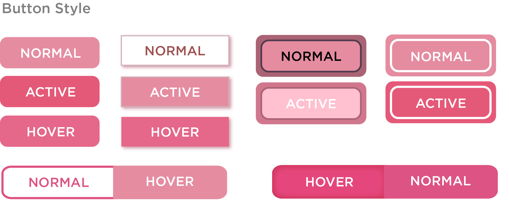
Our button style features clear visual feedback—hover and click states use subtle color changes and shadows to ensure users instantly know their actions are recognized. This enhances usability while keeping the design clean and engaging.
.png)
Our text style emphasizes clarity and consistency, with a strict hierarchy that guides users effortlessly through content. Clear font choices, sizes, and weights create visual order, making information easy to scan and understand.
Figma Link: https://www.figma.com/design/qDzk4oOagEKuBsXK2zyDSb/Fruit-Talk?t=ijTn0kZ9IX36aHtd-1
